Published on May 15, 2025
UX that just clicks
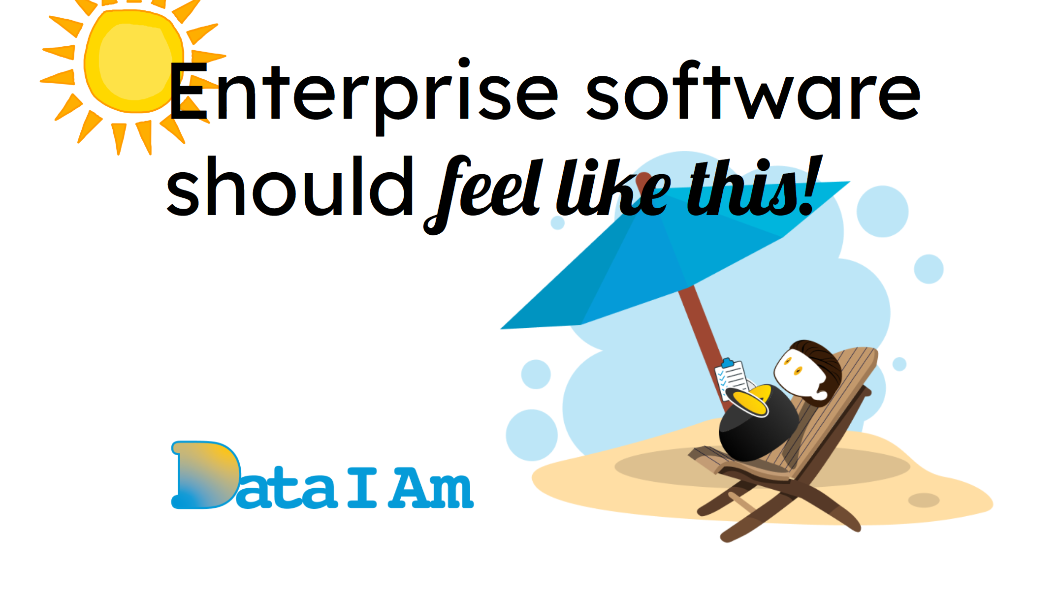
This story is about designing UX for an enterprise app that feels effortless and delightful. It’s the story of DataIAm — an AI-powered data loader for Salesforce.
Why a Salesforce-Specific Data Loader?
In “Why a Salesforce-specific Data Loader”, I explained why the world needed one. TL;DR: generic ETL tools handle complex integrations, but that flexibility comes at a cost — bloated menus with options, endless functions, and dials, 90% of which aren’t needed when all you want is to load a messy spreadsheet into Salesforce.
Target User Persona
Meet Alex Smith — the Salesforce Admin. He wants to load messy spreadsheets quickly and confidently into Salesforce.
MuleSoft, a popular ETL tool, for example, even hosts workshops just to teach users how to use it. Alex doesn’t have time to learn to drive an 18-wheeler just to run an errand. He just needs simple, reliable spreadsheet-to-Salesforce loading.
The Experience Starts With the Website
Great user experience begins at first touch. Our website is self-explanatory, with demo video, animated GIFs to highlight key capabilities, and frictionless self-service signup. All the info needed to get started is right there — no “Call for Pricing” buttons, no barriers.
Deciding How Users Interact
Once we knew we had to build a Salesforce-specifc data loader, we had the why, next, we had to solve the how. We followed an iterative, Design Thinking approach, collaborating internally and with design partners.
Initially, we considered a conversational UI:
Prompt: “Fix and load my data”
Fun in theory. But in practice? Meh. Typing a prompt and checking if AI did what you wanted takes time. We scrapped it. Instead, the heavy lifting happens in the background, and users see clean, AI-tested suggestions.
Our guiding question: how do you design powerful enterprise software that users can just click through — no typing required?
Just Clicks
The vision was clear: DataIAm couldn’t look like a conventional ETL tool. No formulas. No scripts. No 50-step data pipelines. Just effortless data loading.
Every cell in a spreadsheet is analyzed, bad data is flagged and fixed, fields are mapped to Salesforce, missing Record IDs are filled, the preview is displayed, and the job is scheduled — all with just a click.
Keeping the User Informed
The experience doesn’t stop when the data job runs. After a job completes, in-app notifications and emails inform users how it went, highlight any issues, and suggest quick corrective actions. Coming soon: a monitor showing the value DataIAm delivers — records uploaded, missing IDs retrieved, invalid values corrected — all at a glance.
Early Reactions
I was talking to a Salesforce Admin — no slides, no pitch — I just opened our website. A few minutes in, I said:
“Let me show you how to sign up…”
The Admin replied:
“Actually, I’m already in. The signup was easy…”
By the time we finished talking, he was exploring the tool. That’s click-first UX in action.
Making a simple UX for enterprise app is hard — but gratifying when you see delight on customers’ faces.
Key Elements of DataIAm UX
- Familiarity — built on Salesforce Lightning Design System (SLDS) for instant recognition because our target user is a Salesforce Admin.
- Usability — spreadsheet-like interface for intuitive interaction.
- No guesswork — WYSIWYG preview for every data fix. No surprises.
- End-to-end delight — experience starts with the website, continues during the data fixing and loading, and post-job notifications keep users informed.
Experience for Yourself
The best proof of good UX? Experiencing it yourself. Upload a messy spreadsheet, watch DataIAm flag and fix bad data, preview the fixed data, and run your job effortlessly.
See how we’ve designed both app and website to delight Salesforce Admins. Click-first UX, intelligent AI fixes, and frictionless self-service mean anyone can get started in minutes.
Experience it now: https://dataiam.com